
How to Design a Professional Restaurant Menu That Sells

A restaurant menu is more than a list of food and prices. It is one of the most important sales tools in your restaurant. A well-designed menu can guide attention toward profitable dishes, make ordering easier, communicate your brand, and influence how customers perceive the value of your food.
If you are wondering how to design a professional restaurant menu that sells, start by thinking about the customer experience rather than decoration. The best menu design combines clear organization, attractive food descriptions, strategic pricing, readable typography, appealing visuals, and a layout that makes popular or high-margin dishes easy to discover.
Whether you are designing a menu for a fine-dining restaurant, neighborhood café, food truck, takeaway business, or online ordering platform, the principles are surprisingly similar.
This guide explains how to create a restaurant menu that looks professional while also helping customers make confident purchasing decisions.
Why Restaurant Menu Design Matters
A menu is often the first detailed interaction a customer has with your restaurant’s offerings.
A poorly designed menu can create friction. Customers may struggle to find categories, understand unfamiliar dishes, compare prices, or identify popular options.
A professional menu, on the other hand, can:
- Improve readability
- Strengthen restaurant branding
- Highlight signature dishes
- Make ordering easier
- Communicate food quality
- Organize a large selection
- Support upselling
- Create a consistent customer experience
The goal is not simply to make the menu beautiful.
The goal is to make it easy for customers to understand what you offer and choose what they want to order.
Understand Your Restaurant Before Designing the Menu
Before choosing colors, fonts, or photographs, define the restaurant’s identity.
Ask yourself:
- What type of restaurant are you?
- Who is your target customer?
- What type of food do you serve?
- What price range are you targeting?
- What atmosphere do you want to communicate?
- Which dishes are your signature items?
- Which products have strong profit margins?
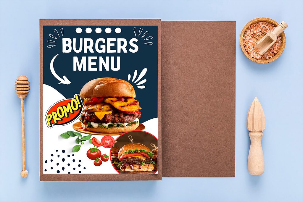
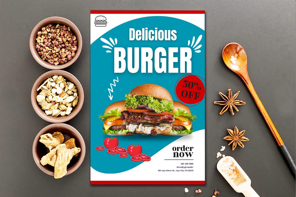
A luxury restaurant might use an elegant, restrained design, while a casual burger restaurant could use bold typography and playful illustrations.
The design should feel like an extension of the restaurant itself.
Plan Your Menu Structure
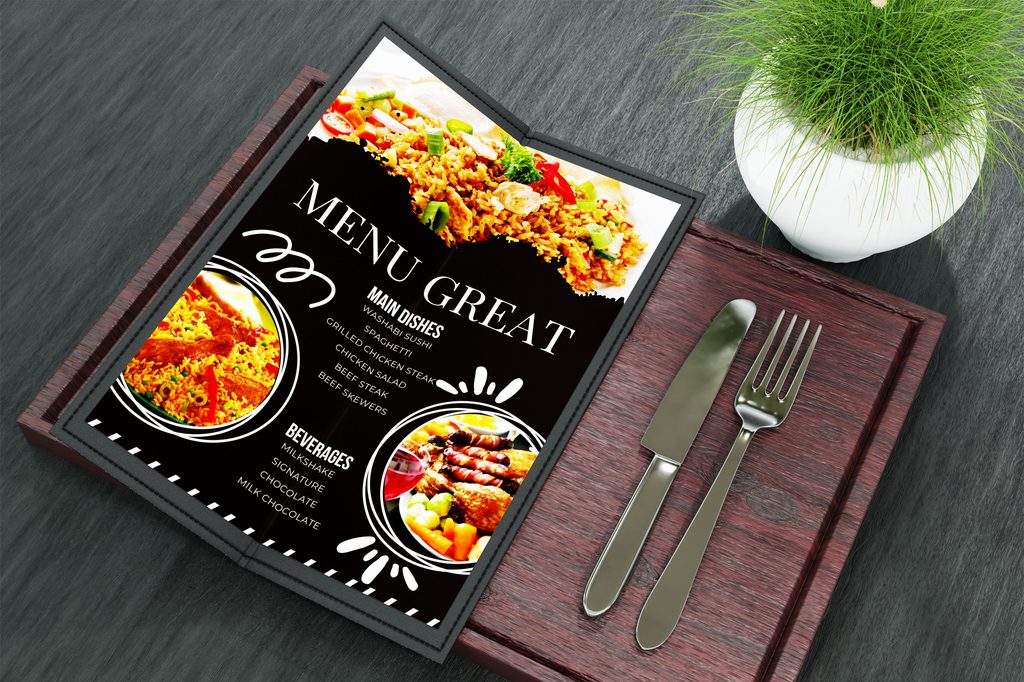
A professional menu should have a logical hierarchy.
Customers should be able to scan the page and quickly understand where different dishes belong.
Common restaurant menu categories include:
- Starters
- Soups
- Salads
- Main courses
- Burgers
- Pizza
- Pasta
- Seafood
- Desserts
- Beverages
- Kids’ menu
- Specials
Do not create categories simply because they sound professional.
Use categories that make sense for your actual food selection.
For example, if you have only three seafood dishes, placing them under a dedicated seafood section may create unnecessary complexity. They could fit naturally within the main-course category.
Keep the Menu Focused
One of the most common menu design mistakes is trying to include too many dishes.
A huge menu may seem like it gives customers more choices, but excessive choice can make decisions harder.
Before finalizing the menu, review every item.
Ask:
- Does this dish sell?
- Does it fit the restaurant’s concept?
- Is it profitable?
- Can the kitchen prepare it consistently?
- Does it offer something different from other menu items?
If an item performs poorly and does not have a strategic purpose, consider removing it.
A focused menu can make the restaurant feel more specialized and organized.
Use a Clear Visual Hierarchy
Visual hierarchy determines where customers look first.
A menu should clearly distinguish:
Category → Dish Name → Description → Price
For example:
GRILLED CHICKEN BURGER
Char-grilled chicken breast, lettuce, tomato, cheddar, and house sauce.
$12.95
The dish name should be easy to identify, while the description should provide enough information to help the customer decide.
Use differences in:
- Font size
- Font weight
- Spacing
- Alignment
- Typography
- Section headings
Avoid making every element equally bold.
If everything is emphasized, nothing stands out.
Choose Restaurant Menu Fonts Carefully
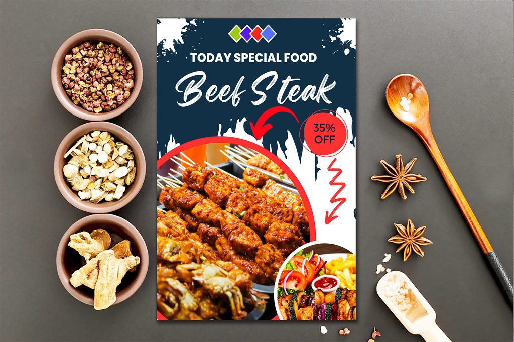
Typography has a major influence on menu readability.
Choose fonts that match the restaurant’s personality but remain easy to read.
For example:
- Serif fonts can create an elegant or traditional feel.
- Sans-serif fonts often feel modern and clean.
- Script fonts can add personality but should be used sparingly.
- Display fonts can work well for headings.
A practical restaurant menu may use one font for headings and another for body text.
Avoid using several decorative fonts throughout the same menu.
Typography Mistakes to Avoid
Common problems include:
- Tiny body text
- Excessive capitalization
- Too many font styles
- Decorative fonts for descriptions
- Poor contrast
- Extremely tight line spacing
Always test the menu at actual viewing size before printing.
Write Food Descriptions That Encourage Ordering
A good food description does more than list ingredients.
Instead of:
Chicken Pasta — $14
Consider:
Creamy Garlic Chicken Pasta
Tender grilled chicken with penne, roasted garlic cream sauce, Parmesan, and fresh herbs.
The second description gives customers a clearer idea of flavor, ingredients, and preparation.
However, avoid turning every description into a paragraph.
A useful menu description should answer:
- What is it?
- What are the main ingredients?
- What makes it special?
Use specific sensory words where appropriate:
- Crispy
- Char-grilled
- Creamy
- Roasted
- Fresh
- Smoky
- Spicy
- Tender
- House-made
Do not make claims you cannot support. Accuracy builds customer trust.
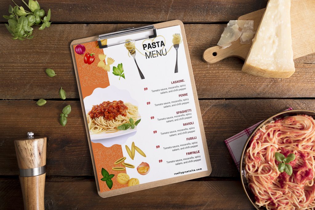
Use Food Photography Strategically
High-quality food photography can make a restaurant menu more attractive, especially for casual restaurants and takeaway businesses.
But more photographs do not necessarily produce a better menu.
Instead of placing a photo next to every dish, consider highlighting a small number of signature products.
Use images for:
- Signature dishes
- Best sellers
- Special combinations
- Seasonal offerings
- Desserts
- Promotional items
Professional-looking food photography should have:
- Good lighting
- Accurate colors
- Appropriate composition
- High resolution
- Clean backgrounds
Avoid low-quality, heavily compressed, or inconsistent images.
Use Color to Strengthen Your Restaurant Brand
Color should support the restaurant’s identity rather than distract from the food.
For example:
| Restaurant Style | Possible Design Direction |
| Fine dining | Minimal, sophisticated palette |
| Café | Warm, relaxed tones |
| Fast food | Bold, energetic colors |
| Organic restaurant | Natural, earthy palette |
| Seafood restaurant | Fresh coastal-inspired tones |
| Modern restaurant | Clean neutral palette |
Use your existing branding whenever possible.
Your menu should visually connect with your:
- Logo
- Website
- Packaging
- Signage
- Social media
- Restaurant interior
This creates a consistent brand experience.
Design Restaurant Menu Pricing Carefully
Price presentation can influence how customers perceive the menu.
Keep prices easy to locate and understand.
Avoid making the price visually compete with the dish name and description.
For example:
Truffle Mushroom Pasta
Wild mushrooms, Parmesan, cream sauce, fresh herbs — 18
The price should be visible without becoming the dominant element.
Also ensure pricing is consistent throughout the menu.
Check:
- Currency symbols
- Decimal formatting
- Spacing
- Alignment
- Tax information where applicable
- Add-on pricing
Never hide important charges or use unclear pricing practices.
Transparency helps create customer trust.
Highlight Signature and High-Value Dishes
Your menu should not treat every item as equally important if certain dishes are central to the restaurant’s business.
You can highlight selected items with:
- “Chef’s Special”
- “House Favorite”
- “Signature Dish”
- “New”
- “Seasonal”
- “Popular”
However, use labels carefully.
If half the menu says “Chef’s Special,” the label loses its meaning.
Choose a small number of genuinely important dishes.
Create Effective Menu Layouts
The layout depends on whether the menu is a single page, folded card, booklet, board, or digital menu.
One-Page Menu
Best for:
- Cafés
- Small restaurants
- Food trucks
- Limited menus
Keep the hierarchy simple and avoid filling every available space.
Multi-Page Menu
Suitable for restaurants with larger selections.
Use consistent navigation across pages.
For example:
Page 1: Starters and salads
Page 2: Main dishes
Page 3: Desserts and beverages
Make sure customers can understand the structure without searching.
Digital Restaurant Menu
Digital menus need special consideration.
Make sure the menu works well on:
- Smartphones
- Tablets
- Desktop screens
Use large enough text, compressed but clear images, and simple navigation.
A customer should not need to zoom repeatedly to read the menu.
Use Menu Psychology Responsibly
Menu layout can guide attention, but good design should help customers make informed choices rather than confuse them.
You can use visual hierarchy to make signature dishes easier to notice.
For example:
Signature Grilled Salmon
Roasted vegetables, lemon butter, herbs — $24
A subtle box or background treatment can distinguish it from surrounding dishes.
Avoid excessive visual tricks. A customer should still be able to compare options easily.
Make Your Menu Accessible and Inclusive
Accessibility is an important part of professional menu design.
Use sufficient contrast between text and background.
Make sure the font is large enough for comfortable reading.
Clearly identify relevant dietary information where appropriate, such as:
- Vegetarian
- Vegan
- Gluten-free
- Contains nuts
- Spicy
- Dairy-free
Restaurant staff should be able to answer ingredient and allergen questions accurately.
Do not use dietary labels casually. Verify them with your kitchen and ingredient information.
Design for Different Ordering Channels
A restaurant may use several menu formats:
- Printed dine-in menu
- Takeaway menu
- QR menu
- Website menu
- Delivery platform
- Social media menu
- Promotional menu
Do not simply upload the printed menu everywhere.
A digital menu may need shorter descriptions, mobile-friendly layouts, and clickable categories.
A printed menu may prioritize physical readability and durability.
Test Your Menu Before Publishing
Never finalize a restaurant menu based solely on how it looks on your computer.
Test it in real conditions.
Print Test
Print the menu at its actual size and check:
- Font readability
- Color accuracy
- Image quality
- Spacing
- Alignment
- Cutting margins
Customer Test
Ask several people unfamiliar with the menu to find:
- A specific dish
- A vegetarian option
- The cheapest main course
- A signature dish
- A dessert
- The price of a particular item
If they struggle, the hierarchy may need improvement.
Mobile Test
For digital menus, test the design on multiple screen sizes.
Check whether customers can quickly:
- Open the menu
- Find categories
- Read descriptions
- View prices
- Understand dietary labels
Common Restaurant Menu Design Mistakes
Too Much Information
A crowded menu can overwhelm customers.
Remove unnecessary text and decorative elements.
Poor-Quality Photos
Blurry or badly lit images can make even good food look unappealing.
Inconsistent Branding
Different fonts, colors, and styles can make the restaurant look unprofessional.
Difficult-to-Read Text
Fancy typography is not useful if customers cannot read it comfortably.
Outdated Prices
An incorrect menu price can create unnecessary customer frustration.
Review your menu whenever prices, ingredients, or dishes change.
Ignoring Seasonal Updates
A menu should reflect what the restaurant can reliably serve.
Seasonal products can also create opportunities for limited-time offerings.
Professional Restaurant Menu Design Checklist
Before sending your menu to print or publishing it online, check the following:
- Restaurant branding is consistent
- Categories are logically organized
- Prices are accurate
- Descriptions are clear
- Signature dishes are easy to identify
- Photos are high quality
- Typography is readable
- Colors have sufficient contrast
- Dietary information is accurate
- Contact information is correct
- Menu has been proofread
- Printed version has been tested
- Digital version works on mobile devices
Frequently Asked Questions
What makes a restaurant menu look professional?
A professional restaurant menu uses clear organization, readable typography, consistent branding, accurate pricing, appealing descriptions, high-quality visuals, and enough white space to prevent the design from feeling crowded.
How many items should a restaurant menu have?
There is no universal number. The appropriate size depends on the restaurant concept, kitchen capacity, customer expectations, and available ingredients. The menu should contain enough variety without creating unnecessary complexity.
What colors are best for a restaurant menu?
There is no single best color combination. Choose colors that support the restaurant’s brand and maintain strong readability. Contrast between text and background is more important than following a particular color trend.
Should every restaurant menu have food photos?
No. Some restaurants benefit from carefully selected food photography, while others may achieve a more sophisticated appearance with typography and layout alone. Use images where they genuinely help customers understand or appreciate the product.
How do I write good restaurant menu descriptions?
Focus on the dish’s key ingredients, preparation method, flavor, and distinctive qualities. Keep descriptions concise and accurate while using specific sensory language that helps customers understand what they are ordering.
What font is best for restaurant menus?
The best font is one that fits the restaurant’s personality while remaining highly readable. Serif, sans-serif, and limited decorative fonts can all work when used appropriately. Avoid overly complicated typography for essential information.
How can a menu increase restaurant sales?
A clear menu can make ordering easier, highlight selected dishes, communicate value, and reduce decision friction. Strategic layout, accurate descriptions, appealing visuals, and clear pricing can all contribute to a better ordering experience.
Final Thoughts
Learning how to design a professional restaurant menu that sells starts with understanding that a menu is both a design piece and a customer communication tool.
The strongest menus do not rely on decoration alone. They combine thoughtful structure, readable typography, persuasive but accurate descriptions, strategic photography, consistent branding, clear pricing, and a layout that makes the customer’s decision easier.
Start with your restaurant’s identity and target customer. Organize your dishes logically, highlight the items you want customers to notice, remove unnecessary clutter, and test the finished menu with real people before publishing it.
Whether you are creating a printed menu, QR menu, takeaway design, or digital restaurant menu, thoughtful design can make your food easier to discover and your brand easier to remember.
If you’re looking for customizable digital design resources, templates, and creative products for your restaurant or business, explore Imagenish.com for practical solutions that can help turn your ideas into polished visual materials.